
Lamborghini has updated its brand logo for the first time in over 20 years. This logo redesign aims to align with the brand’s visual expression to its new strategy, better reflecting Lamborghini’s three core values of being “bold”, “unexpected”, and “genuine”.
This symbolizes Lamborghini’s commitment to always push beyond limits, standards, and conventions with the motto “Driving Humans Beyond.” The logo refresh harmoniously coincides with Lamborghini’s electrification strategy, called ‘Direzione Cor Tauri’ (Toward the Heart of the Bull), signifying a strategic shift for Lamborghini’s future.
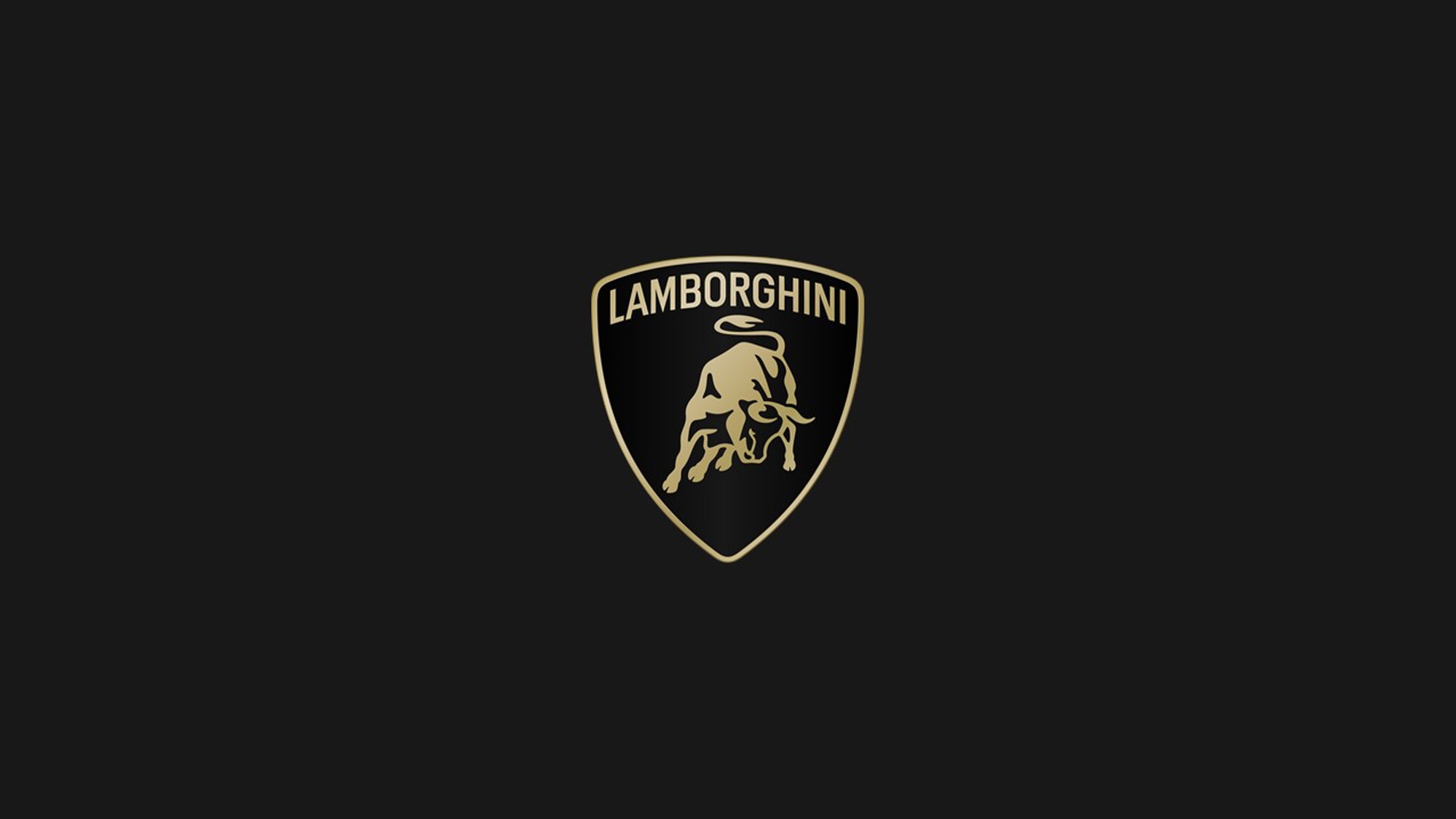
The most notable change is the simplification to a flat design devoid of gradients, featuring a distinctly outlined central iconic bull and shield. Additionally, the Lamborghini font has been widened for a more intense impression, employing black and white as the brand’s identity colors.
To accentuate Lamborghini’s dynamic image further, new yellow and gold accents have been incorporated. The renewed logo will be applied to all upcoming Lamborghini models. Moreover, at digital touchpoints, the central bull will be utilized separately from the classic shield logo.
The official Automobili Lamborghini font, reflecting the sharp lines and angles of the cars, expresses a striking and sporty image. Furthermore, a new set of icons developed in collaboration with Lamborghini’s motorsport division, Centro Stile, will be used for the first time.
This strategy aims to build strong partnerships with future generations, becoming a model for innovation and sustainable development. The local House of Sant’Agata Bolognese is implementing changes not just in automobiles but throughout corporate identity, impacting the company’s culture and values, bringing new expressions in all visual aspects.
Automobili Lamborghini will advance towards the future armed with a new logo that embodies innovation and determination amidst a rapidly changing environment.
Written by: 이상진 daedusj@autodiary.kr